Showing posts with label 8bit. Show all posts
Saturday, March 24, 2012
Nintendo Tribute: R.O.B.--(Don't do any art)
It's been a while folks, and the reason for that is that I needed to take a break. Not for anything serious, but more because I was not happy with what was coming out. I would try and rush different pieces, over and over, and in the end it would look like crap. So I would spend a lot of time pouring over a piece only to throw it in the trash (lame).
A friend of mine said to me, "Why are you trying to hard? Why don't you take a break?" The only one that is really going to see this is you any maybe a few people that happen across this blog. So...last weekend I decided to not pick up a pen, not a stylus (well I might have worked on something for a little bit) but that was for about 20 mins. I literally did nothing art related. I saw some friends, played a lot of video games, I went to a party, watched a lot of Netflix....but no art. You know what? It really worked.
Sometimes when you are stuck the best thing to do is to not do anything. If you push too hard, then you might just push the creativity away and that's not the desired end result. So....when you're not sure what to do, sometimes the best thing to do is "nothing".
So, I took a break, did more lessons and study during the week and then came up wtih the portrait of R.O.B. (Your Robotic Operating Buddy from the old school Nintendo days).
I wasn't even planning on doing this one, but it came out pretty well.
In the middle of working on this one, I also figured out some process things to make the end result look a little better.Woo! This one is going in the book!
-http://murdockink.tumblr.com/
-http://murdockink.blogspot.com/
-http://moebocop.deviantart.com/
-http://twitter.com/mauricemurdock
Also Buy prints here:
-http://society6.com/mauricemurdock
Sunday, February 12, 2012
Nintendo Tribute: Elevator Action
This week's post is of Elevator Action, which is not necessarily a game that I so much played on Nintendo per Se, but more a game that was still fun from the 80's. So I figured "why not include it in the book". There are some things that I tried in this piece, that I think worked out pretty well, however there is always room for improvement (in this case namely with the color). At any rate, below are the steps for how I got to the final piece.
Below: I wanted to come up with an interesting composition, so as always I did a number of composition studies, but they were all of the side view. I finally realized that the best view would be to have the main character shooting/looking/interacting with the viewer. Much more interesting than a boring side view. So after a few sketches, below was the final composition that I came up with. I wanted to have him running away from enemy agents, and shooting over his shoulder to have a feling of action to the piece.
Below: Now depending on the idea/subject matter, etc. I normally just skip right into drawing, etc. after doing some research etc. but...in this case I realized that in order for this to not* look like crap, I would need as close to a live model as possible. Since I didn't have one of those handy, I decided to just use myself. I set up my camera on my mantle, used the self timer setting and then took one or two shots of me looking over my shoulder while "dashing".(I used a pair of scissors as my "gun"). Despite the fact that I do NOT look like a super awesome secret spy, I decided that this would be a good reference to start work. As I go I am realizing how important research is, because without it, your drawing is just not going to look right.
Below: I did an initial sketch, then did a basic line sketch on top of that, and then started filling in the shadow layers and the highlights.I wasn't sure who to make the character look like, so I used Errol Flynn as a model, which I thought worked ok....I of course gave him a face scar...because....really who is going to mess with a guy with a face scar, would you? The lesson learned here is that structure, form, value and lighting are pretty much the most important parts of your piece. Without it, the rest of the piece is going to look sucky. It took me a couple of tries to learn, that, but hopefully I just saved you a lot of work.
Below: Now the biggest issue that I had with this one was how to apply color. As a matter of fact, I got to the point where I would add the color, and then get to a certain point, and I would hate it! A lot. I was getting bogged down in the order of whether to apply color first, and then shadows, or* whether to apply shadows and then color. On top of that, I was also getting bogged down on HOW to actually apply the color in the piece, because I would try a number of tactics, and it would not work.
It took a couple of tries, but I finally figured out the proper order for how to apply each (it still needs some finessing, but at least I have the basics down)--for now until I find a better way.
Below: From there I went in and I worked on top of everything, using various combinations of multiply, softlight, overlay, etc. and layer adjustment settings to get things to where I wanted them.
Again the biggest challenge here was the lighting (it always is). I wanted parts of the piece highlighted, and other parts not as prominent, I think it works, but again there is always room for improvement.
I also learned that painting metal is def. not easy. I will need to work on ways to make it not look so "chalky". Anyway, Elevator Action is done, and is def. going in the book!
p.s.
Small piece of trivia...I just discovered that the name of the character that you play in the game is "Agent 17: aka--Otto"! Who knew...
-http://murdockink.tumblr.com/
-http://murdockink.blogspot.com/
-http://moebocop.deviantart.com/
-http://twitter.com/mauricemurdock
Also Buy prints here:
-http://society6.com/mauricemurdock
Sunday, February 5, 2012
Mighty Bomb Jack! (Again)
So here is the final Mighty Bomb Jack piece. I had posted this before, but of course I am never happy with anything that I do, and until I am, I am always tempted to do things over and over again and experiment. In fact that is one of the benefits to Photoshop, and it's hinderances as well.
There are so many layer settings, button options and menu options in the program that the possibility for outcomes is almost infinite. This of course makes this overwhelming when you are trying to develop a style and be consistant. I am working on another fun piece now (Elevator Action) which is getting there, but I had to basically start the thing over three times, because I was not happy with how it was coming out at all (and I might be a semi-obsessive-compulsive perfectionist)
All in all though the theory is that the more work you put together and the more work you do, the sooner you will arrive where you want to be. At least that the goal.
Anyway...enjoy!
There are so many layer settings, button options and menu options in the program that the possibility for outcomes is almost infinite. This of course makes this overwhelming when you are trying to develop a style and be consistant. I am working on another fun piece now (Elevator Action) which is getting there, but I had to basically start the thing over three times, because I was not happy with how it was coming out at all (and I might be a semi-obsessive-compulsive perfectionist)
All in all though the theory is that the more work you put together and the more work you do, the sooner you will arrive where you want to be. At least that the goal.
Anyway...enjoy!
Monday, January 23, 2012
Back from Central America (Art Book cover sketches and more..)
Hey gang,
I'm back from Central America after a week of shaping and molding young minds. It was a really great week, and I feel so lucky to have been able to share time with those students.
You can see some of their wonderful photos on the Design 4 Kids Facebook page:
https://www.facebook.com/Design4Kids
While I was there I had some time when I was not teaching class. I managed to start work on some cover designs as well as complete the final list of pieces that will be included in the book:
Here is the final list (in no particular order and not all necessarily Nintendo games:)
-Megaman (2)
-Clu Clu Land
-Pro Wrestling
-Mario
-Ducktales
-Elevator Action
-Legend of Kage
-Ring King
-Mighty Bomb Jack (gonna fix the cover)
-Sonic
-10 Yard Fight (if I have time)---I never really played 10 Yard Fight that much but it seems to ba a favorite. So if I can make it happen I will fit it in.
I managed to complete all of the composition sketches so now it's on to knocking these out one by one.
I plan on starting that this week, so I am pretty excited about that.
As a quick treat below are some logo and cover sketches (kinda early but this will give you just a quick idea of the cover layout).
Below are some sample logos ideas:
Below are some cover ideas:
I'll start posting as I work through the ideas.
See ya soon!
I'm back from Central America after a week of shaping and molding young minds. It was a really great week, and I feel so lucky to have been able to share time with those students.
You can see some of their wonderful photos on the Design 4 Kids Facebook page:
https://www.facebook.com/Design4Kids
While I was there I had some time when I was not teaching class. I managed to start work on some cover designs as well as complete the final list of pieces that will be included in the book:
Here is the final list (in no particular order and not all necessarily Nintendo games:)
-Megaman (2)
-Clu Clu Land
-Pro Wrestling
-Mario
-Ducktales
-Elevator Action
-Legend of Kage
-Ring King
-Mighty Bomb Jack (gonna fix the cover)
-Sonic
-10 Yard Fight (if I have time)---I never really played 10 Yard Fight that much but it seems to ba a favorite. So if I can make it happen I will fit it in.
I managed to complete all of the composition sketches so now it's on to knocking these out one by one.
I plan on starting that this week, so I am pretty excited about that.
As a quick treat below are some logo and cover sketches (kinda early but this will give you just a quick idea of the cover layout).
Below are some sample logos ideas:
Below are some cover ideas:
I'll start posting as I work through the ideas.
See ya soon!
Saturday, January 7, 2012
Nintendo Tribute: Double Dragon 2
This weeks post is Double Dragon (the second part of the tribute--Jimmy Lee). I think that the first character is called Billy. For this one I decided to go against the dark background of the last post, and this time around decided to do a twilight/sunset scene. (I really like sunset scenes/shots.) I find that they are easier to create and develop than a night scene. I also tried out a new signature to make it more official in the 2K12. See below for some steps to see what I was thinking while I was painting this guy.
1) So after the last Double Dragon post, I decided that I needed some help. I wasn't sure where I was going wrong and looked into watching more tutorials, podcasts, etc. etc. I learned a few things such as how to create better backlighting, and also about the sketch process. Basically, the sketch is the key to doing a good piece of work. Lots of times I would scan a sketch from my sketchbook, and then go right into painting. However this time around, I decided to take the extra step and go over my lines, because I was finding that the painting process was getting difficult. What's funny is that I still really look the textured look of sketch lines. So I will have to work to see how to make this more interesting. Anyway below is the sketch phase.
2) and here is the line phase. I created the lines on a seperate multiple layer over the sketch layer (I also set the sketch layer to multiply). I don't know about you guys, but the layer order is the thing that always always always messes me up and gets confusing. (below)
3) Below you see that I start to block in the basic colors on a normal layer between the basic line art layer (above) and the sketch layer that I scanned in initially. At this point I start to determine where my light source is coming from as this will help me make my decisions on shadows later on.
4) Below I start to fill in all of the basic colors as well as determine the background. Since I want the scene to appear in a twilight setting, I decided to go with a gradient background where the sun is the source of the light and everything is hilighted accordingly. I am finding that lighting is the hardest thing to get the hang of, but is another key to making a convincing piece.
5) At this stage I start to go over my lines and paint over the lines on a new layer.
6) Then at this point I have a sense of where I want to go with the piece, what I need to do color wise, and what bits need more details. Usually by this point I have a sense of what I am doing and all of my basic decisions have been made so now it's just a matter of finishing things up.
7) Below is the final piece. In the background I added some clouds to fill the space and then had the colors reflect off of the clouds accordingly. You won't be able to see it really since I made it a point to soften the background. I am sure that I will learn a better way to do this. I also am going to try and work on making the piece more textured and vibrant. It seems a little too smooth. All in all though I like this one and will put this in the book!
8) Next up Ducktales. Yeah....I know..it's a game that was super awesome....and I really loved it. See ya next time.http://murdockink.tumblr.com/
http://moebocop.deviantart.com/
http://twitter.com/mauricemurdock
Tuesday, December 27, 2011
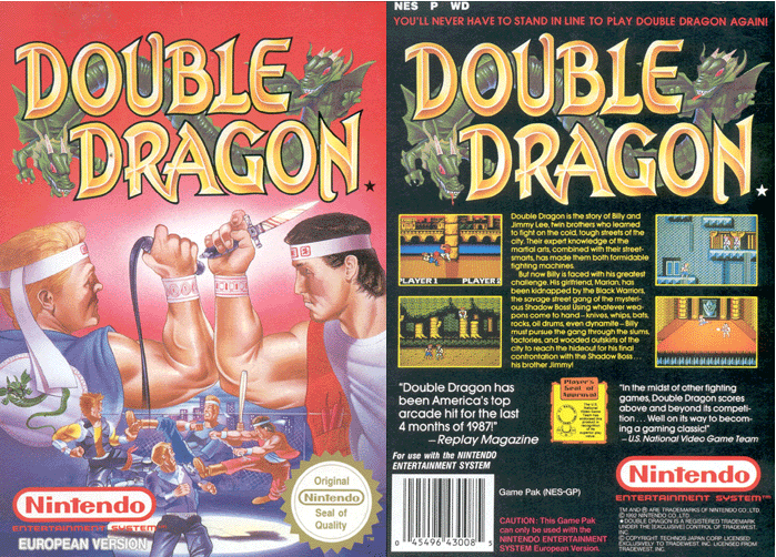
Nintendo Tribute: Double Dragon
Ok, so the next in the Nintendo tribute series is Double Dragon. You played as one of two brothers or friends (I think), who had to fight your way through hordes and hordes of street gangs to rescue your girlfriend. For this particular piece I decided to try to work on anatomy, but do it in a simplified manner to suggest the form, but not go overboard with the details. Hm. It took me a while to post this one, because I wasn't too hot on how it came out, however since I need to finish things I decided to post this one as a means to move onwards and learn from my mistakes. (Practice practice practice).
Steps are below:
In the end, it's not the worst, but in practicing I learned a few tricks a long the way to make the painting process easier. If I go over my original sketches and create a simple line drawing, that will eliminate having to work so hard when starting the color phase. Also, anatomy anatomy anatomy and values. Very hard to master, but I will be psyched when I get it. So that's it for this one, next up is Jimmy Lee (Double Dragon part II).
http://murdockink.tumblr.com/
http://moebocop.deviantart.com/
http://twitter.com/mauricemurdock
Steps are below:
http://murdockink.tumblr.com/
http://moebocop.deviantart.com/
http://twitter.com/mauricemurdock
Sunday, December 11, 2011
Sonic the Hedgehog!
Ok so this week, I decided to do a rework of Sonic the Hedgehog, which was something that I had done a while back. but......I thought that it was lame (colors needed work, etc. etc.). So I went back and reworked this piece a big and finished it. Below is the final work:
Below are just a few notes about the work:
Started with a sketch. I did a couple of drawings in my sketchbook, but decided to just go with the basic front shot of Sonic running at you.
At this point last time I stopped and thought that it was done, but I decided to go one further and add another layer and paint on top of it, and to then add the color.
Next Up: Double Dragon (again) ! Yee Haw!!!
http://murdockink.tumblr.com/
http://moebocop.deviantart.com/
http://twitter.com/mauricemurdock
Below are just a few notes about the work:
Started with a sketch. I did a couple of drawings in my sketchbook, but decided to just go with the basic front shot of Sonic running at you.
At this point last time I stopped and thought that it was done, but I decided to go one further and add another layer and paint on top of it, and to then add the color.
I found a sparkly brush and used that on the rings in the background. Here is Sonic folks enjoy!
http://murdockink.tumblr.com/
http://moebocop.deviantart.com/
http://twitter.com/mauricemurdock
Labels:
80's,
8bit,
art,
awesome,
commercial,
digitalpainting,
mauricemurdock,
sega,
sonic
Monday, December 5, 2011
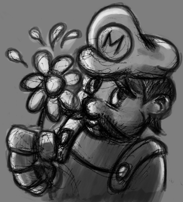
Nintendo Tribute: Mario
A little surprise this week as I did an extra mini piece. You can't have a Nintendo tribute without Mario. Even though Mario has been done over a million times I haven't really done Mario before, and so I figured "why not". Here is the final!
(Final!!)
Here are the steps:
I started with a basic round brush, and then instead used different brushes that I created from an actual paintbrush. I noticed that the end result looks a lot mote textured and not as flat. In addition I used a color palette from an already existing Mario image, so that I can get the colors right (before they were looking really pastelle-y and too soft.
Next Up: Double Dragon! Yee Haw!!!
http://murdockink.tumblr.com/
http://moebocop.deviantart.com/
http://twitter.com/mauricemurdock
(Final!!)
Here are the steps:
Next Up: Double Dragon! Yee Haw!!!
http://murdockink.tumblr.com/
http://moebocop.deviantart.com/
http://twitter.com/mauricemurdock
Sunday, December 4, 2011
Nintendo Tribute: Bubble Bobble!
The Nintendo Tribute for this week is "Bubble Bobble". Another game I played endlessly, it was super fun and involved dragons, bubbles and fruit! How fun! Below is the final piece, and below that are the steps! This one is going in the book as well! Enjoy!
1. Sketch
2. Values and shadows
3.
4.
5.
6.
Final!
http://murdockink.tumblr.com/
http://moebocop.deviantart.com/
http://twitter.com/mauricemurdock
1. Sketch
2. Values and shadows
4.
5.
6.
Final!
http://murdockink.tumblr.com/
http://moebocop.deviantart.com/
http://twitter.com/mauricemurdock
Subscribe to:
Posts (Atom)