Showing posts with label illustration. Show all posts

Tuesday, March 13, 2018

Treat our Day Job (9 to 5) As Your Second Job


For years I was always referring to my day job as my first job and my after work pursuits as my second job.  Recently I had a conversation with a friend of mine and who mentioned to me that for the longest time we have been thinking about this the wrong way. The day job can actually be thought of as the supplementary one. The day job is the thing that funds your other exploits (if you choose to think of it that way). This one is actually your second job. The things that you do outside of your day job exploits are the real work. 
Those are the things that drive you and give you passion and pleasure and purpose (to me it does).

The trick is to find a day job that does not overtake your real* job. The jobs that really give you passion and purpose. 
For the longest time I had it so wrong. Its’ such an old world inflexible way of thinking about how you spend your time leading towards your goals.
I am at the point now where I no longer think that way. It’s the things that give you passion that are your real career. Think if it as your passion career or your spirit career.  Everything else is just a job.

Now for some people their 9 to 5 is* their passion and that’s great. It has never been that way for me. We now are able to reframe our world the way that you want to and I am glad to be living in it.
Too bad that it took me this long to figure it out.

Instagram: Moebocop
Vero: Moebocop

Tuesday, January 9, 2018

2017 vs. 2018

I am sure that you have seen lots of posts from people discussing successful strategies in 2017 and what their plan is for 2018 is, etc. I to have thought about this, but don’t plan on writing about that now extensively. However, there are a few things I want to do more of this year, namely through art and practice. 

I just ordered and completed “Alla Prima A Contemporary Guide to Traditional Direct Painting”. It is a beautiful book about art and painting technique. 

I have been avoiding buying physical books due to space and clutter avoidance (I mostly buy e-books and have them electronically instead). This book in particular is really wonderful. It describes the painting techniques via different contemporary artists and the tools that they used to achieve these results. The book includes art tools, types of art (self portrait vs. portrait vs. landscape work) all really well done and presented in a digestible manner. 

One of the practice methods listed was copying master techniques via master studies.
When I was took the Oatley Art Academy of online course a few years ago, this was the first time that this concept was introduced. (Prior to that I had done a few master copies, but I didn’t really do them enough to get any value from them.) 

There is a lot to be gained from reviewing and practicing master studies. 

Namely understanding choices that the artist made when making heir piece. I was so inspired by this that I plan to spend a whole chunk of time this year dong them along with my own work. 
My technique will be to go through the text, and pick the pieces and artists that I find the most inspirational. 
I will them from month to month. This means of deliberate practice will add loads of information to my repertoire and further inform and expand my skills this year. 
Artists that I have selected are as follows:
-Cecelia Beaux
-Arthur Decosta
-Rachel Constantine
-Willam Merritt Chase
-Theodore Robinson
-Jon Redmond
-Peter Paul Reubens
-John Singer Sargent

(to name a few):

I am looking to start this month and am anxious to see what comes out! 

Wednesday, January 3, 2018

Holiday Rawk 2017 Post Show Wrap Up

So the Holiday Rawkshow is over (thanks so much to everyone who came out and supported). 
It was something I was happy to be a part of. Was it a success overall? Yes, was it a success for me personally? Yes and* No. It was a mixed bag. You might be asking why. 
I normally don’t show a lot of work which is something I would like to change in 2018. 
When I got the invitation to the show, I had mixed feelings. Historically, I never really liked sharing my work in public. I decided I was going to change that this year, and take on the challenge of getting out there and sharing my work with the public. Here are a few hilights of what happened when I did. 

Wins:

The show had tons of people and was well attended as advertised:
Lots of times I go to an event where the promise of a huge crowd is part of the billing. 
Then it turns out it’s little to no people show up. This time around though the turnout was really fantastic.

The organization as set up was top notch:
The staff and team was well organized and provided superior service. It was unlike anything 
I had experienced before. We had semi-weekly calls, they were available constantly for questions. Additionally anything we requested was for the most part granted. They really went out of their way to make us feel cared for and welcome.

The variety of art was vast, it was a true showcase of varied art talent:
The event had visual artists, fashion, hair, makeup, jewelry and other types of performing artists. 
It was was a wide array of talent and was super impressive to see.

My set up was pretty easy, and I was easily able to transport all of my work:
Unlike printing and brining physical pieces of artwork, I was able to easily set up and take down my work via portable projector. Using a projector instead of brining physical pieces made the event a lot more user friendly. No more lugging physical pieces of work, or storing extra work in my studio. Now I can bring and show as many pieces of work as I want, and it only takes up the space of a small shoebox. 

Learnings: 

(Here are some things that I learned by showing work at the Holiday show this year for next time)
An assault on the senses:
A holiday showcase is just that: a showcase for all types artists, and as a result there is a lot of conflict for people’s interests. So when a person comes and is assaulted by many sights and sounds, they may be overwhelmed and not know where to look.

A lot of people, not a lot of space:
The issue with projecting against a flat surface is the projection can be obstructed is there is not enough room to show work. At first I was able to project easily against the makeshift screen that I had created (made from a hung up white sheet). However the more people entering the space, the less and less people were able to see the work until no one could see anything. 
Once the music started it was a total wash. There was no designated space to show work, and instead it became part of the background noise after a while.

Lack of engagement with people:
Because the space was so overrun with attendees, there was no room to actually engage with people who were curious about what I was showing. I was not able to speak to folks directly and could not talk about the work, or share business cards, etc. I mainly shared work, with the people who came to the event to support (family and friends). Which I appreciated.

Sales? What Sales?:
My strategy this time around was to hand out business cards to anyone interested. 
Again, a good strategy in theory, but not in practice. I found that people come to a holiday event like this one, looking for cheap deals. They are less willing to spend money on a piece of art for hundreds of dollars. People become tight fisted especially around the holidays.

So all in all, I am super glad I did the show, but will think about doing a more visually oriented show the next time around. One focused on visual arts and not a mix of a bunch of different art types. 
It will be easier to show work, and less fighting for people’s attention.

p.s.

Here are some photos from the Holiday RAWK 2017 event:
https://rawartists.smugmug.com/JERSEY/HolidayRAWk2017/


I wish everyone a really Happy and Fantastic 2018!

Tuesday, December 26, 2017

The Value of Personal Projects

You might be a designer or painter or musician for your day job. Even if none of these are your profession,  you might spend a significant amount of time writing, drawing or painting for your boss or client. 
They have demands you are there to fulfill, and so most of your day might be spent meeting them. 
However, what do you really want to make or paint or create for yourself? What idea do you have that you want to throw down on a canvas and see come to life. These ideas may never get the money or recognition that you want, but they are there in your brain need to get out. This is your dream or personal project. It’s the thing you want to make for yourself that is near and dear to you. However how do we define “personal project”?


Define Personal Project?

The fact it is personal means it is yours and yours alone. You can say, draw, paint, make whatever you want to. That is the ideal goal behind the thing you want to make. Lots of times when I am at my day job, I will have an idea for a painting or a few and they go into a list that I have for myself. This is my “project list” or “idea list”. You might want to keep one for yourself in case you run out of inspirational ideas when you sit own to do work. When the time comes to start a new project and I don’t have an idea ready I look at the idea list to see if I can get any inspiration. This idea list fuels the personal project and can get you stared. The idea behind the personal project is that you create the thing that you want to see alive if someone gave you the time or the money to do so. Make the play, the song, the painting anything that you want to see alive and kicking and living. You are your won boss when it comes to the dream project so what you say goes. 

How Long Should it Take?

The answer is it should take a long as it takes. There is no real end timeframe that works for everyone.  When you are done you will “know” it for yourself. One summer, I was working for different companies, and I decided that after my next job had “ended” I was going to take several ,months off and just practice painting and drawing. This was a personal project I really wanted to see happen. I made the time and budgeted enough personal savings to see this come to light. In the end I spent about 8 months off from day job work, just to concentrate on getting better at drawing, and painting. I didn’t really preplan the length of time it would take to complete this for myself. I felt the time I put in was all valuable, because it meant a lot to me. It was my personal dream project for myself. In essence my dream project was not what I was making during those 8 months. My dream project was myself. I was putting time into myself to get where I wanted it to be, by practicing and getting better at the thing that I loved to do, which is drawing and painting.

What are some tings to take away from it?

Aside from piece of mind and the ability to nurture your self another hidden side benefit of the personal project is the fact you get to practice certain skillsets. For example if you want to make a personal project and write a book, you can take those 8 months off and put time into writing. Or if you want to make a play or a drawing, the hidden benefits are the experiences you get for doing the thing for yourself as your side project. At the end of the 8 months, I took off, I was better at anatomy finishing work from start to finish,  brainstorming idea concepts and making complete work. 
I was able to crank out more and more paintings because I put in the time investment to produce more of them. As a result I was further along skill-wise than had I not taken the 8 months off in the first place. 

You will also eventually see, the hidden benefits for the side project and the skills that you will gain while reaching your goals. You can then inject these skills back into client work (or your next side project).

Sunday, August 24, 2014

Jack of Hearts

Jack of Hearts piece completed!

I have started using "Pinterest" for all of my reference work and such. That can be found here if you want to get a sneak peek into the behind the scenes:

Enjoy!


Here is some Netsky to listen to while you enjoy looking at this one:

Monday, September 9, 2013

Baltimore Comic-con sketches

A lot of comic-con shows involve waiting to interact with people if they are interested in your work. Between that and selling, there is also crowd watching which is always fun! Below are some sketches from this past weekend.


http://moemurdock.com
http://moebocop.cghub.com


Tuesday, February 21, 2012

Nintendo Tribute: Ducktales


This week tribute is Ducktales, which is a game that I played a lot and was surprisingly addictive.
I don't think this one was as popular as the other main Nintendo games, such as Metroid, Mike Tyson, etc. etc. however this game was still a fun one to play. Nothing really special in terms of process that I did for this one, just the same basic steps. Hope you like!


-http://murdockink.blogspot.com/
-http://moebocop.deviantart.com/
-http://twitter.com/mauricemurdock

Also Buy prints here:
-http://society6.com/mauricemurdock


Sunday, February 12, 2012

Nintendo Tribute: Elevator Action


This week's post is of Elevator Action, which is not necessarily a game that I so much played on Nintendo per Se, but more a game that was still fun from the 80's. So I figured "why not include it in the book".  There are some things that I tried in this piece, that I think worked out pretty well, however there is always room for improvement (in this case namely with the color). At any rate, below are the steps for how I got to the final piece.

Below: I wanted to come up with an interesting composition, so as always I did a number of composition studies, but they were all of the side view. I finally realized that the best view would be to have the main character shooting/looking/interacting with the viewer. Much more interesting than a boring side view. So after a few sketches, below was the final composition that I came up with. I wanted to have him running away from enemy agents, and shooting over his shoulder to have a feling of action to the piece.

Below: Now depending on the idea/subject matter, etc. I normally just skip right into drawing, etc. after doing some research etc. but...in this case I realized that in order for this to not* look like crap, I would need as close to a live model as possible. Since I didn't have one of those handy, I decided to just use myself. I set up my camera on my mantle, used the self timer setting and then took one or two shots of me looking over my shoulder while "dashing".(I used a pair of scissors as my "gun"). Despite the fact that I do NOT look like a super awesome secret spy, I decided that this would be a good reference to start work. As I go I am realizing how important research is, because without it, your drawing is just not going to look right.

Below: I did an initial sketch, then did a basic line sketch on top of that, and then started filling in the shadow layers and the highlights.I wasn't sure who to make the character look like, so I used Errol Flynn as a model, which I thought worked ok....I of course gave him a face scar...because....really who is going to mess with a guy with a face scar, would you? The lesson learned here is that structure, form, value and lighting are pretty much the most important parts of your piece. Without it, the rest of the piece is going to look sucky. It took me a couple of tries to learn, that, but hopefully I just saved you a lot of work.


Below: Now the biggest issue that I had with this one was how to apply color. As a matter of fact, I got to the point where I would add the color, and then get to a certain point, and I would hate it! A lot. I was getting bogged down in the order of whether to apply color first, and then shadows, or* whether to apply shadows and then color. On top of that, I was also getting bogged down on HOW to actually apply the color in the piece, because I would try a number of tactics, and it would not work.
It took a couple of tries, but I finally figured out the proper order for how to apply each (it still needs some finessing, but at least I have the basics down)--for now until I find a better way.

Below: From there I went in and I worked on top of everything, using various combinations of multiply, softlight, overlay, etc. and layer adjustment settings to get things to where I wanted them.

Again the biggest challenge here was the lighting (it always is). I wanted parts of the piece highlighted, and other parts not as prominent, I think it works, but again there is always room for improvement. 
I also learned that painting metal is def. not easy. I will need to work on ways to make it not look so "chalky". Anyway, Elevator Action is done, and is def. going in the book!

p.s.
Small piece of trivia...I just discovered that the name of the character that you play in the game is "Agent 17: aka--Otto"! Who knew...


Sunday, January 29, 2012

"Monst-Her"


I call this one "The Monst-Her". This is basically a combination of "the Creature from the Black Lagoon and Swamp Thing" but the female version. Not anything really dramatic to speak of, but just for fun.

The idea came to me while I was down in Central America. I definitely took a sketch book with me, and along with finishing up the other sketches for the tribute book, I also put down whatever came to mind. This was one of those ideas.

In addition, I was also reading "Color and Light" by James Gurney (you can get it at Amazon here if you are interested). It's a pretty great book, pretty simple to get through and has a lot of really informative tips on setting up color palettes, and color schemes. 

I had definitely made my way up to working with creating color schemes, and up until now I was using color scheme designer. The thing that I was missing though was about color gamuts, and limited color palettes.

In short, using the color wheel, you essentially limit the colors that you use by drawing a polygon (a triangle, a rectangle, etc.) and then sticking to the colors within the polygon. What you will then get is a color scheme that is complimentary with each other (as long as you stick within the shape). Below is an example of a gamut mask pulled from the color wheel.
I found a site called livepaintinglessons.com that allows you to create your own gamut masks and you can use that as part of your piece/painting.
Now you can use this same technique when creating your own pieces.

In other news the art book is coming along nicely, and I will posting the Mighty Bomb Jack rework next!

'Til next time..

http://murdockink.tumblr.com/
http://moebocop.deviantart.com/
http://twitter.com/mauricemurdock


Monday, January 23, 2012

Back from Central America (Art Book cover sketches and more..)

Hey gang,

I'm back from Central America after a week of shaping and molding young minds. It was a really great week, and I feel so lucky to have been able to share time with those students.
You can see some of their wonderful photos on the Design 4 Kids Facebook page:
https://www.facebook.com/Design4Kids

While I was there I had some time when I was not teaching class. I managed to start work on some cover designs as well as complete the final list of pieces that will be included in the book:

Here is the final list (in no particular order and not all necessarily Nintendo games:)
-Megaman (2)
-Clu Clu Land
-Pro Wrestling
-Mario
-Ducktales
-Elevator Action
-Legend of Kage
-Ring King
-Mighty Bomb Jack (gonna fix the cover)
-Sonic
-10 Yard Fight (if I have time)---I never really played 10 Yard Fight that much but it seems to ba a favorite. So if I can make it happen I will fit it in.
I managed to complete all of the composition sketches so now it's on to knocking these out one by one. 
I plan on starting that this week, so I am pretty excited about that.
As a quick treat below are some logo and cover sketches (kinda early but this will give you just a quick idea of the cover layout).

Below are some sample logos ideas:

Below are some cover ideas:

I'll start posting as I work through the ideas.
See ya soon!


Friday, January 20, 2012

Design 4 Kids 7!

Hey all,

I wanted make a quick note to let you know that I am on hiatus for a bit (read out of the country).
I am currently attending an overseas program called
"Design4Kids7", which is a great program that takes place in Guatemala Central America.

The program is designed to teach local students about the principles of graphic design, typography, photography as well as using tools such as Photoshop and Illustrator.

I was able to lead a drawing class this week as well, which gave the students the chance to get hands on drawing practice, doing gesture drawings, portrait drawings, memory drawings and blind contour drawings. It was all a lot of fun and gave the kids some hands on drawing practice and trying something new.

If you want to take a look at some of the photos the students have been posting, you can take a look at the Design for Kids Facebook page (make sure you like it):
http://www.facebook.com/Design4Kids

Also to learn more about the organization itself check out:
http://design4kids.org/

I will be back next week with more news and tid bits about the 80's video game art book coming out in April!

See you then!


Thursday, January 12, 2012

X-men Rogue

This week's post is coming a little bit early and I am headed out of town for the next week or so.
I didn't want to leave you guys without a post for the week. So this week I decided to take a bit of a break from the Nintendo book and try something different. I don't normally do superheroes (although I love them)..but since everyone else does it I like to be different. However, in the spirit of doing different things, I decided to try and paint over someone else's lines, which turned out to be pretty awesome.
I have been following this guy and Deviant art for a while (http://weaponx5203.deviantart.com/).
One day I asked him if I could pick something from his gallery and paint over the work.

He said "sure" and below is what I got:
Here are the steps to get to the end result:

1. Below: I picked the sketch of Rogue from the gallery it was the one with the cleanest lines and I was a fan of the sketch. I heard a lot that the key to a great painting is the sketch and the drawing underneath and it's really true. If you have a crappy drawing no amount of painting over it is going to fix it. See the sketch below:
2: Below: then I added a background gradient to set up the color tone of the painting:
3: Below: One tip that I picked up is before you start laying down any permanent lines, you should do some color tests. This means that you can try different color schemes and see which one works the best. Even different color backgrounds as well. In this case I kept the background green because it goes nicely with the yellow in Rogue's costume.
4: Below: I start to add color flats and the shadows and I make the decision that the light should be coming from the top right side of the image.
5. Below: One tip that I learned that also helps was to use a wireframe form lines to try and define the shape. This helps to keep the image from being flat, helps to define the form and helps when adding shadow and defining the form.
6. Below: Shadows added
7. Below I start to go over the lines and do the paintover. I will usually leave the light source indicator in place to serve as a reminder as I work.
8. Below is the final! Shout out to Weaponx for letting me paint over his work!
See you in a week guys!!!!!

http://murdockink.tumblr.com/
http://moebocop.deviantart.com/
http://twitter.com/mauricemurdock

Tuesday, December 27, 2011

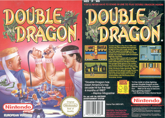
Nintendo Tribute: Double Dragon

Ok, so the next in the Nintendo tribute series is Double Dragon. You played as one of two brothers or friends (I think), who had to fight your way through hordes and hordes of street gangs to rescue your girlfriend. For this particular piece I decided to try to work on anatomy, but do it in a simplified manner to suggest the form, but not go overboard with the details. Hm. It took me a while to post this one, because I wasn't too hot on how it came out, however since I need to finish things I decided to post this one as a means to move onwards and learn from my mistakes. (Practice practice practice).
Steps are below:


In the end, it's not the worst, but in practicing I learned a few tricks a long the way to make the painting process easier. If I go over my original sketches and create a simple line drawing, that will eliminate having to work so hard when starting the color phase. Also, anatomy anatomy anatomy and values. Very hard to master, but I will be psyched when I get it. So that's it for this one, next up is Jimmy Lee (Double Dragon part II).

http://murdockink.tumblr.com/
http://moebocop.deviantart.com/
http://twitter.com/mauricemurdock


Sunday, November 6, 2011

Mighty Bomb Jack (Process Post)

I have been trying to think of a these for the MOCCA fest book that will be out for the April show. I think that for the first official book, I am going to do a collection of paintings/pieces from Nintendo games that I grew up playing (and there were a lot). One of the first games that I grew up playing was Mighty Bomb Jack (a game where you were super hero who had to collect bombs and avoid mummies and floating skulls. Very fun!)


One of the things that I have learned was that I need to focus more on shapes and composition. I did a number of sketches to try and figure out what the best composition would be (below)
Then I scanned the composition/sketch that I liked and then went over it again in Photoshop and Painter. I then started to add the shadow values an tried to keep the light source in mind. (below)

I then started to add in the flat colors on a new layer (I started with the center figure first). (below)
...then continuing onto the background layers after..(below)
Then finally I covered everything with a paintover layer, added the textures, lighting effects and final polish. (below)