
Also Buy prints here:

Showing posts with label maurice murdock. Show all posts
Showing posts with label maurice murdock. Show all posts
Saturday, July 28, 2012


Sunday, February 5, 2012
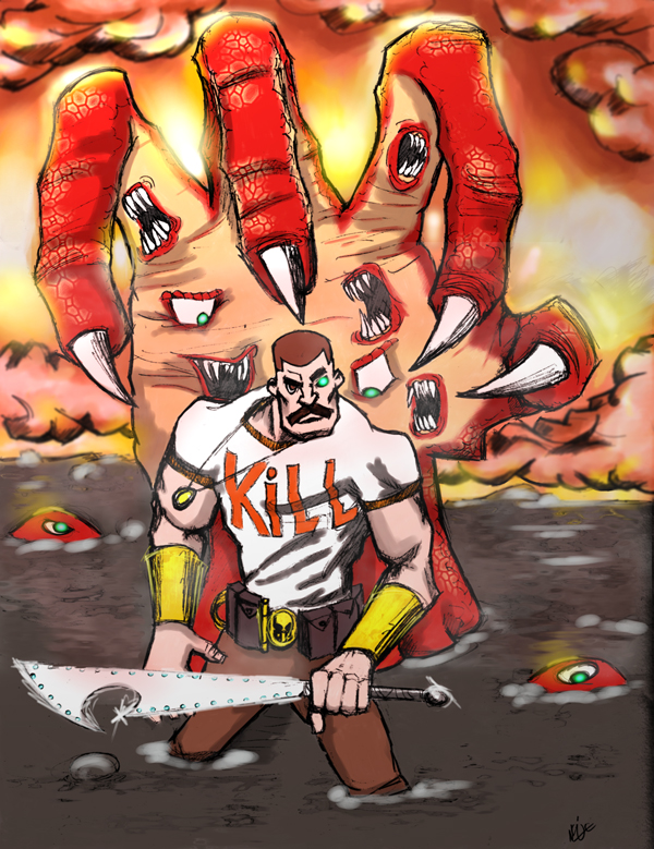
Mighty Bomb Jack! (Again)

There are so many layer settings, button options and menu options in the program that the possibility for outcomes is almost infinite. This of course makes this overwhelming when you are trying to develop a style and be consistant. I am working on another fun piece now (Elevator Action) which is getting there, but I had to basically start the thing over three times, because I was not happy with how it was coming out at all (and I might be a semi-obsessive-compulsive perfectionist)
All in all though the theory is that the more work you put together and the more work you do, the sooner you will arrive where you want to be. At least that the goal.
Anyway...enjoy!
Recently Published in Accent UK comics!
In other great news. Last year I met the chaps over at UK comics at MOCCA fest (the indie small press comic book festival and trade show) they were def. cool guys and I have kept in touch with them over the past year.
A while ago I got asked to contribute a piece to the hard cover anthology book (the theme being about robots of course). I found out last week, that I recently got a piece published.
The book is a collection of short stories about robots...and who doesn't like robots?
You can learn more about the anthology and about Accent UK comics here:
http://accentukcomics.blogspot.com/2012/01/manchester-mart-robot-shorts-and-all.html
http://murdockink.tumblr.com/
http://moebocop.deviantart.com/
http://twitter.com/mauricemurdock
A while ago I got asked to contribute a piece to the hard cover anthology book (the theme being about robots of course). I found out last week, that I recently got a piece published.
The book is a collection of short stories about robots...and who doesn't like robots?
You can learn more about the anthology and about Accent UK comics here:
http://accentukcomics.blogspot.com/2012/01/manchester-mart-robot-shorts-and-all.html
http://murdockink.tumblr.com/
http://moebocop.deviantart.com/
http://twitter.com/mauricemurdock
Sunday, January 29, 2012
"Monst-Her"

I call this one "The Monst-Her". This is basically a combination of "the Creature from the Black Lagoon and Swamp Thing" but the female version. Not anything really dramatic to speak of, but just for fun.
The idea came to me while I was down in Central America. I definitely took a sketch book with me, and along with finishing up the other sketches for the tribute book, I also put down whatever came to mind. This was one of those ideas.
In addition, I was also reading "Color and Light" by James Gurney (you can get it at Amazon here if you are interested). It's a pretty great book, pretty simple to get through and has a lot of really informative tips on setting up color palettes, and color schemes.
I had definitely made my way up to working with creating color schemes, and up until now I was using color scheme designer. The thing that I was missing though was about color gamuts, and limited color palettes.
In short, using the color wheel, you essentially limit the colors that you use by drawing a polygon (a triangle, a rectangle, etc.) and then sticking to the colors within the polygon. What you will then get is a color scheme that is complimentary with each other (as long as you stick within the shape). Below is an example of a gamut mask pulled from the color wheel.

Now you can use this same technique when creating your own pieces.
In other news the art book is coming along nicely, and I will posting the Mighty Bomb Jack rework next!
'Til next time..
http://murdockink.tumblr.com/
http://moebocop.deviantart.com/
http://twitter.com/mauricemurdock
Wednesday, September 28, 2011

Tuesday, September 27, 2011

Wednesday, June 15, 2011

Sunday, June 12, 2011

Wednesday, June 8, 2011
Jersey City Concept Painting 1 Done

Alrighty, this is the first of my ideas for the JCindependent cover contest. It's finally done. My idea here is to take places in JC and to then put a different sci-fi spin on them. This image is from a picture that I took over on Warren and 1st street (about a block away from my place.) Instead of a hi-rise and the power substation, instead we have robots and flying bots. I think the way that this came out, only next time I will use elements that are totally from pictures that I took. This image has some stock art, so I will have to challenge myself next time and build elements from scratch. (done in Painter 11)
Tuesday, June 7, 2011
Messing around with PS5

I grabbed the demo for photoshop 5 tonight...and just started playing around with the new blender brush tools...so good..

Sunday, June 5, 2011
Afro Samurai!

Time to setup the new computer now...
Thursday, June 2, 2011

Wednesday, June 1, 2011
Demon Hunter Done (Part 2)

This is another version of the Demon Hunter image that I was working on for the bi weekly challenge over at the CG-Hub site. I thought that I was done but then I decided that I needed to work even harder on values before adding color instead of jumping ahead (I just get super excited about adding the color bit). So, I went back and reworked this piece (again) and added more contrast with the oil's brush.
This home however, I def. liked the way that it came out. So, I can safely say that I am done and done.
Now on to the next forreals..Up Next: Afro Samurai!!!
Monday, May 23, 2011
Demon Ass Kicker Final Image!
Final image of Demon Ass Kicker Character contest over on the CG-Hub site.


Demon Ass Kicker Process..
So to keep things going until I start my painting my class in July, I have been participating in a number of different sketch challenges over on the CG-Hub site. The challenge this week was to do a character of a Demon Hunter. I decided to go full Painter on this one as a means to continue to compare the two programs (Painter vs. Photoshop). Below is the process post to the final image.
1. Start with a sketch as usual. I came up with a back story for this character to help to define the character more. (See below)

2. Drawing clean up (I did this in Photoshop) (See below):
 3. Added tones (I found a new basic ink brush in Painter that gave clean basic tones):


1. Start with a sketch as usual. I came up with a back story for this character to help to define the character more. (See below)

2. Drawing clean up (I did this in Photoshop) (See below):


4. Added basic colors to the image (See below):

5. Final Color adjustments and lighting effects:
Sunday, May 15, 2011
LochNess Monster Tutorial

I have been working on learning both Photoshop and Painter, bit by bit.
A while back I got a Painter tuorial book that I have been making my way through. I put it down when the Photoshop classes started, but now that the Photoshop class is over with, I have picked the tutorial book back up again. This chapter focused on a Loch Ness Monster image (the image was not something that I drew). I just followed the steps and did the walk through as the book instructed. I liked this image a lot, so I thought that I would post it. Enjoy!
Wednesday, May 11, 2011
CG Hub Mermaid Challenge Process
Ok, so I have been a little bit busy as of late. I have been taking a digital coloring class, for coloring line art using Photoshop, which was fun, and I definitely learned a lot. Since I couldn't color line art before, I have a little bit more in the skills department now that the class is over with. My next goal is to focus on learning how to digitally paint. Some of the principles on how to paint digitally and color line art are the same. So I decided to just try and go for broke and see if I could digitally paint an image based on the basic principles of value and color. So I decided to enter the CGHub Drawing Jam (which is a bi-weekl y contest where you have to submit an image based on a theme). The theme this time around was "Mermaids"...and below is my entry.
1. I first did a number of sketches, to try to come up with something that was both an interesting image and that told a litle bit of a story. I decided on the image below that tells a "mermaid in a jar" type story.

 3. When done I duplicated the "value layer" and prepared to start painting "between the two layers. (below)
 4. I then start to add basic flat color, using the established values as a guide (see below)
 5. I then flatten the image and begin to work on adding color and texture "on top" of the flattened image focusing on lighting and setting the mood for the piece. (see below)

6. Once I like where the drawing is going I work to finish up the drawing and to then also focus on the little details like rear lighting, and bubbles (see below)
 7. I then add rear lighting behind the professor, and work to complete all of the details in the image by using a really small brush. (see below)
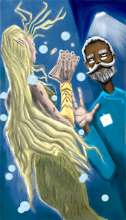
8. As an uber last step, I add in a reflection in the image finish up the image and use the hue/saturation settings to finish up the image and voila my entry is done. (see below)

1. I first did a number of sketches, to try to come up with something that was both an interesting image and that told a litle bit of a story. I decided on the image below that tells a "mermaid in a jar" type story.

2. Then I added values to the image and tried to settle on the lighting and direction. (below)


8. As an uber last step, I add in a reflection in the image finish up the image and use the hue/saturation settings to finish up the image and voila my entry is done. (see below)

Sunday, April 24, 2011
More Black Swan W.I.P.


I then went in and added some colors to the piece (I had only intended to do a basic color of a pen and ink drawing. However during the process a happy accident happened and I realized that if I moved the color layer above* the line layers and then added values I would somewhat get the same effects of a painting (not as refined of course)

I have to say that even though the painting is not necessarily masterful...I def. like the way that this came out. This was a total accident, but I am excited about the day that I can get this result on command. Oh and Happy Easter!
Friday, April 22, 2011

Subscribe to:
Posts (Atom)